g. design
g. design
g. design
g. design
menu
ferriani.sbolgi
ferriani.sbolgi is a creative studio with a focus on product, furniture and surface design, founded in 2020 by Marco Ferriani and Sara Sbolgi.
00

year
2021
timeframe
1 month
category
Branding and Identity
concept
Creating a logo which would be clean, elegant and minimal, in order instantly hint at the core aesthetic of Sara and Marco as product designers. The client wanted a solution for the naming of the logo that would represent both, in a way that would unite them but without losing each of their identity. They seek the new, the bold and the different, but always with timeless taste and quality craft in mind.
Creating a logo which would be clean, elegant and minimal, in order instantly hint at the core aesthetic of Sara and Marco as product designers. The client wanted a solution for the naming of the logo that would represent both, in a way that would unite them but without losing each of their identity. They seek the new, the bold and the different, but always with timeless taste and quality craft in mind.
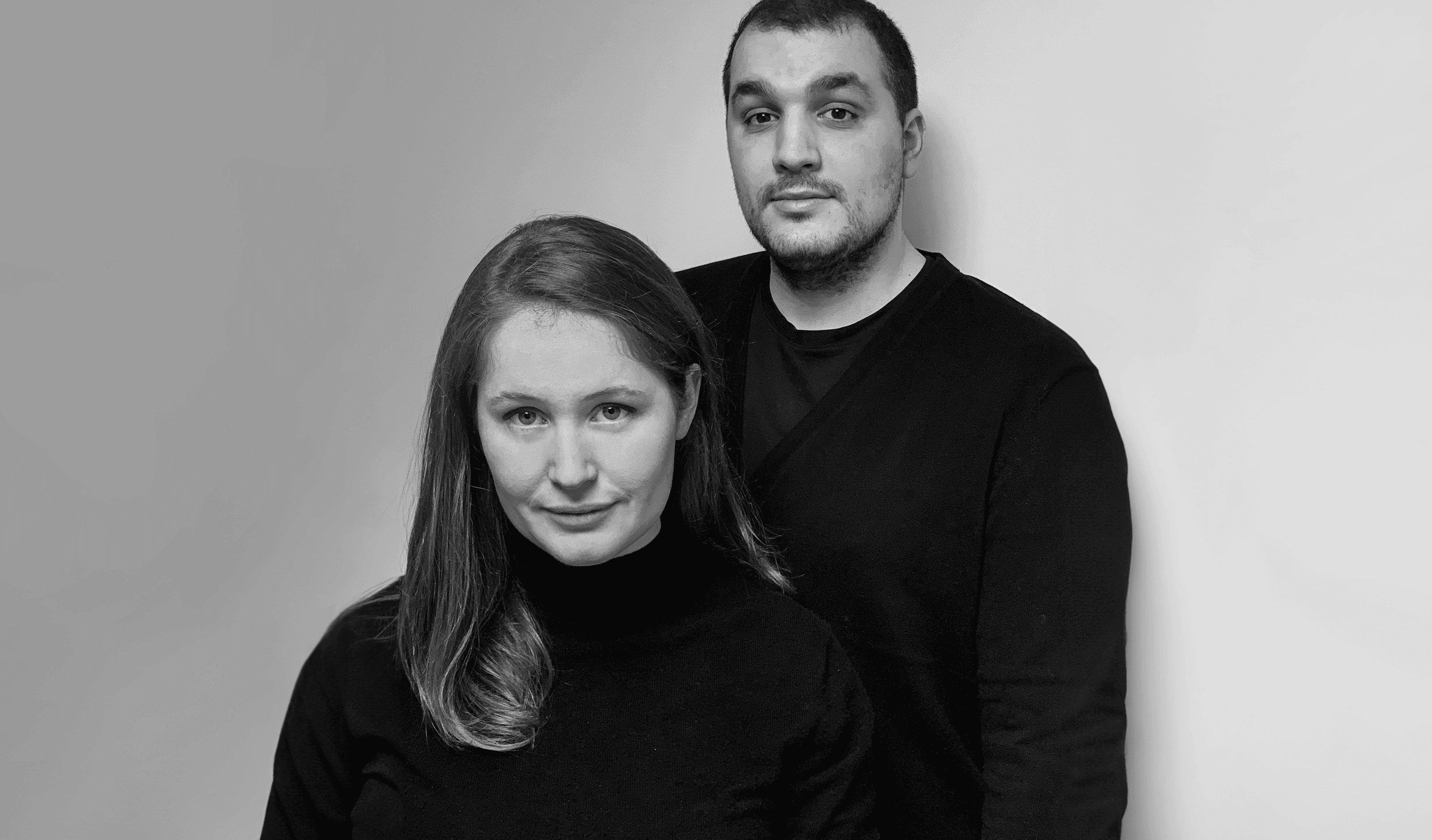
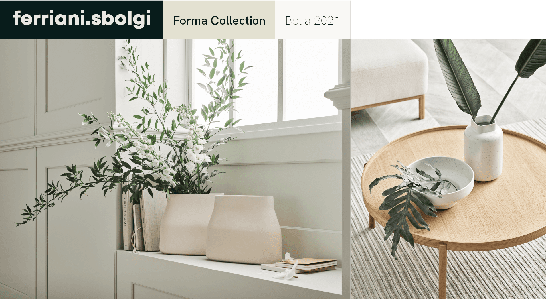
The Italian design studio, Ferriani Sbolgi, is driven by experiments and a cooperative approach to the design process.
Their design language is based on sleek silhouettes and clean stripped-down lines and details, and their products seek to communicate a certain emotion with the viewer and user. Each new design is seen as an opportunity for experimentation, and they ascribe fundamental importance to finding materials and ideas that will add value to their final design.
Series of logos proposed to the client.
01
Logo

02

Brand Colors
03
see similar projects
say hello
i'm open for freelance projects, feel free to email me to see how can we collaborate
say hello
i'm open for freelance projects, feel free to email me to see how can we collaborate
say hello
i'm open for freelance projects, feel free to email me to see how can we collaborate
say hello