g. design
g. design
g. design
g. design
menu
adevinta
A global classifieds specialist with market-leading positions in key European markets.
00
year
2023
timeframe
8 months
category
Branding and Identity
concept
Adevinta is a global classifieds specialist with market-leading positions in key European markets. It's a house brand that own many well known second-hand platform, such as eBay Kleinanzeigen, subito.it, leboncoin, mobile.de and Marktplats. The local brands are very popular but the owner brand needed a redesign to be recognisable and gain traction within potential employees and customers.
Adevinta is a global classifieds specialist with market-leading positions in key European markets. It's a house brand that own many well known second-hand platform, such as eBay Kleinanzeigen, subito.it, leboncoin, mobile.de and Marktplats. The local brands are very popular but the owner brand needed a redesign to be recognisable and gain traction within potential employees and customers.
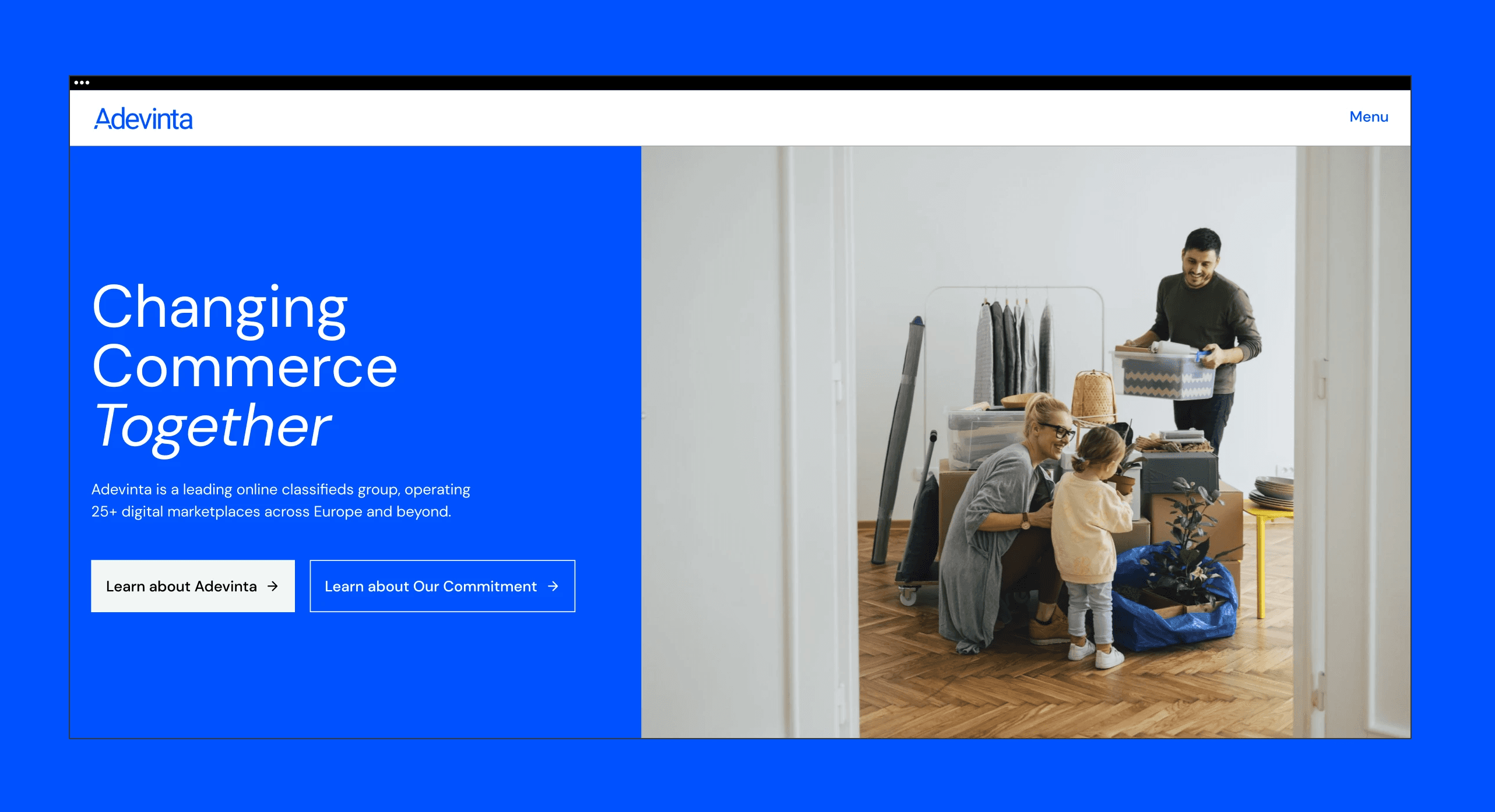
From its inception, Adevinta aimed to revolutionize the way technology connect buyers and sellers, helping people find jobs, homes, cars, consumer goods and more. Every day Adevinta empower millions of individuals all over Europe to make sustainable choices and fight the war on waste.

It was very important to translate Adevinta's core values via its new visual look, feel and tone of voice. The main goal was to find the right balance between a modern, forward-looking brand that values technology and wants to use it in order to make conscious shopping choices.
This was achieved mainly through an update on the typography, colors and photography. With photography playing a big role in balancing out the tech aspect of the brand, by bringing same warm and relatable imageries.
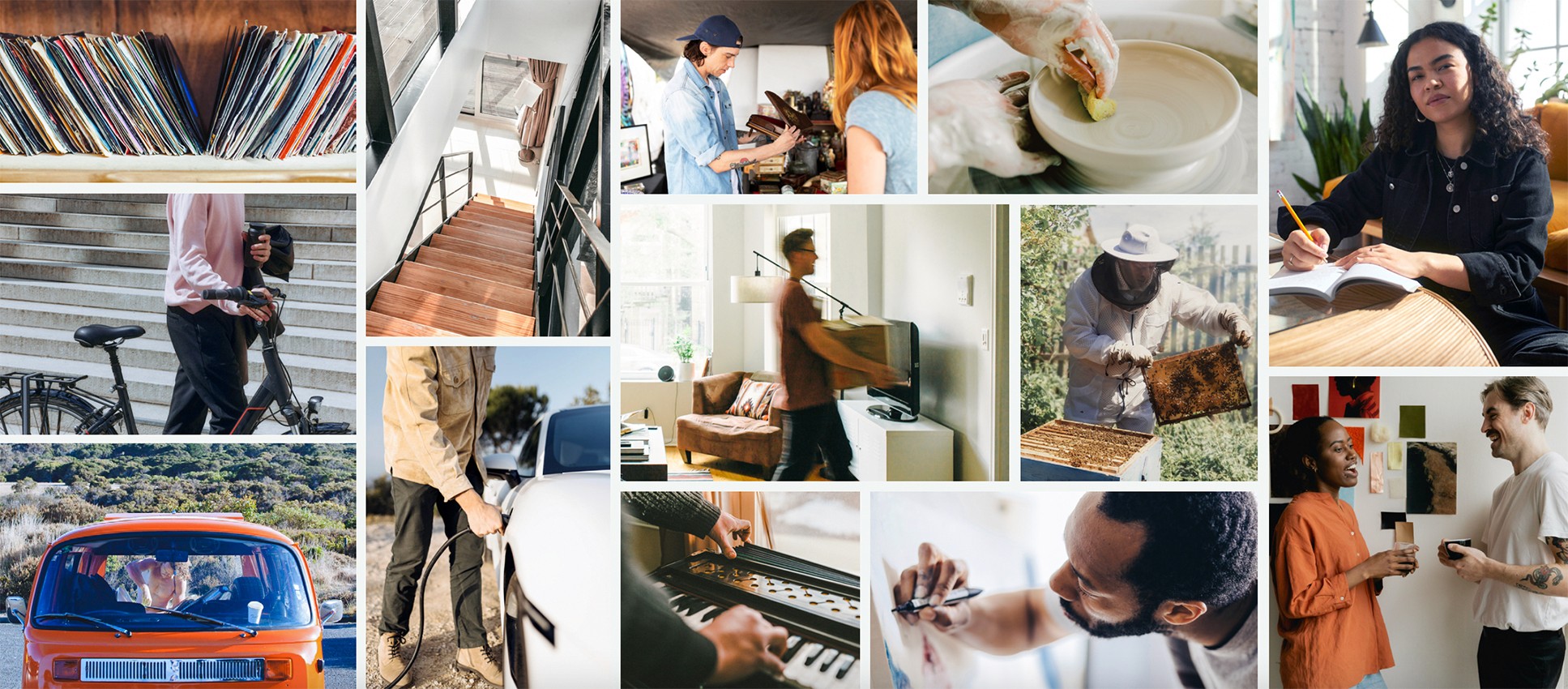
Throughout the development process a big part of the visual refresh was given to the iconography, which needed to be very extensive and to cover seven big categories, for a total of 90 icons.
The first four categories are related to the core business of the brand and its marketplaces: Real Estate, Mobility, Re-Commerce and Advertising.
The other 3 categories are designed thinking about internal use: Sustainability & DEI, People & Processes and Communication & Feelings.
From its inception, Adevinta aimed to revolutionize the way technology connect buyers and sellers, helping people find jobs, homes, cars, consumer goods and more. Every day Adevinta empower millions of individuals all over Europe to make sustainable choices and fight the war on waste.
It was very important to translate Adevinta's core values via its new visual look, feel and tone of voice. The main goal was to find the right balance between a modern, forward-looking brand that values technology and wants to use it in order to make conscious shopping choices.
This was achieved mainly through an update on the typography, colors and photography. With photography playing a big role in balancing out the tech aspect of the brand, by bringing same warm and relatable imageries.
Throughout the development process a big part of the visual refresh was given to the iconography, which needed to be very extensive and to cover seven big categories, for a total of 90 icons.
The first four categories are related to the core business of the brand and its marketplaces: Real Estate, Mobility, Re-Commerce and Advertising.
The other 3 categories are designed thinking about internal use: Sustainability & DEI, People & Processes and Communication & Feelings.
01
Typography
02
Layout system designed for digital and print assets
03

see similar projects
say hello
i'm open for freelance projects, feel free to email me to see how can we collaborate
say hello
i'm open for freelance projects, feel free to email me to see how can we collaborate
say hello
i'm open for freelance projects, feel free to email me to see how can we collaborate
say hello